Bigleaf customers have always loved that our Cloud-first SD-WAN automatically detects, categorizes and prioritizes their traffic to ensure consistent uptime and performance. Now, they’re getting a whole new level of visibility into that traffic and how it’s been categorized and prioritized by the Bigleaf platform.
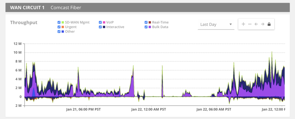
Bigleaf is thrilled to announce our new QoS Class Visualization feature, giving Bigleaf customers full visibility into the makeup of inbound and outbound traffic across every internet circuit.
Now Bigleaf users can use the QoS Class Visualization to drill down through their own company’s traffic to see how their throughput breaks down by traffic category across each of their circuits. They’ll be able to see exactly how Bigleaf is adjusting traffic flows based on circuit condition and identify high-level trends in cloud usage across their organization.
Discover unidentified or unexpected increases in cloud and application traffic
Because Bigleaf’s intelligent software categorizes 100% of your traffic automatically, our new QoS Class Visualization will show you when new traffic types appear on your network. Now IT and networking professionals can identify traffic patterns and trends for applications or cloud services that they didn’t even know were being used by their organization.
See what’s causing spikes or growth in throughput and plan accordingly
With Bigleaf’s QoS Class Visualization, you can see spikes and upward trends in performance-sensitive traffic like VoIP and Virtual Desktop. This gives you the information you need to add additional circuits or capacity *before* you have an issue.
Want to see how your data is shaping up?
The QoS Class Visualization is available to all Bigleaf customers in the web dashboard. Simply log in to your Bigleaf account and see your own traffic by QoS Class.